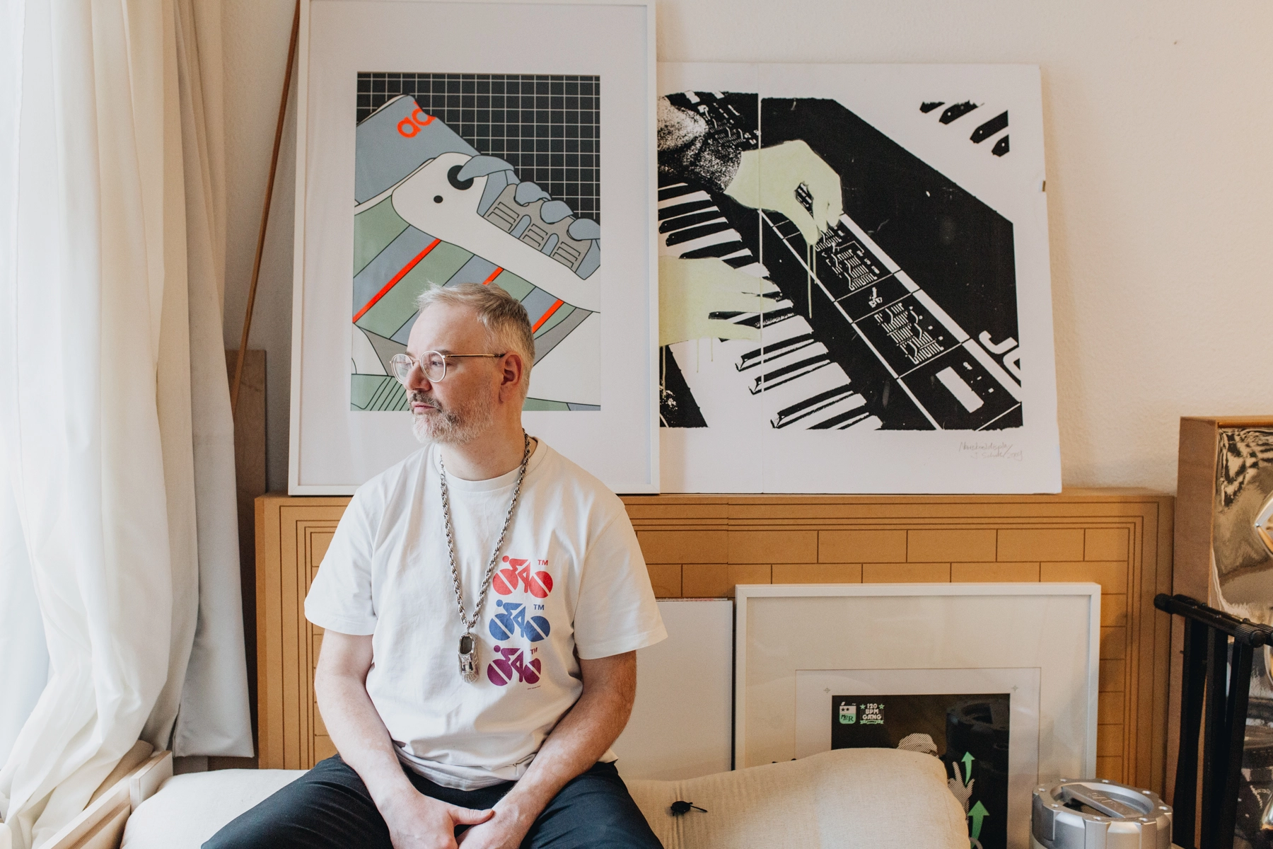
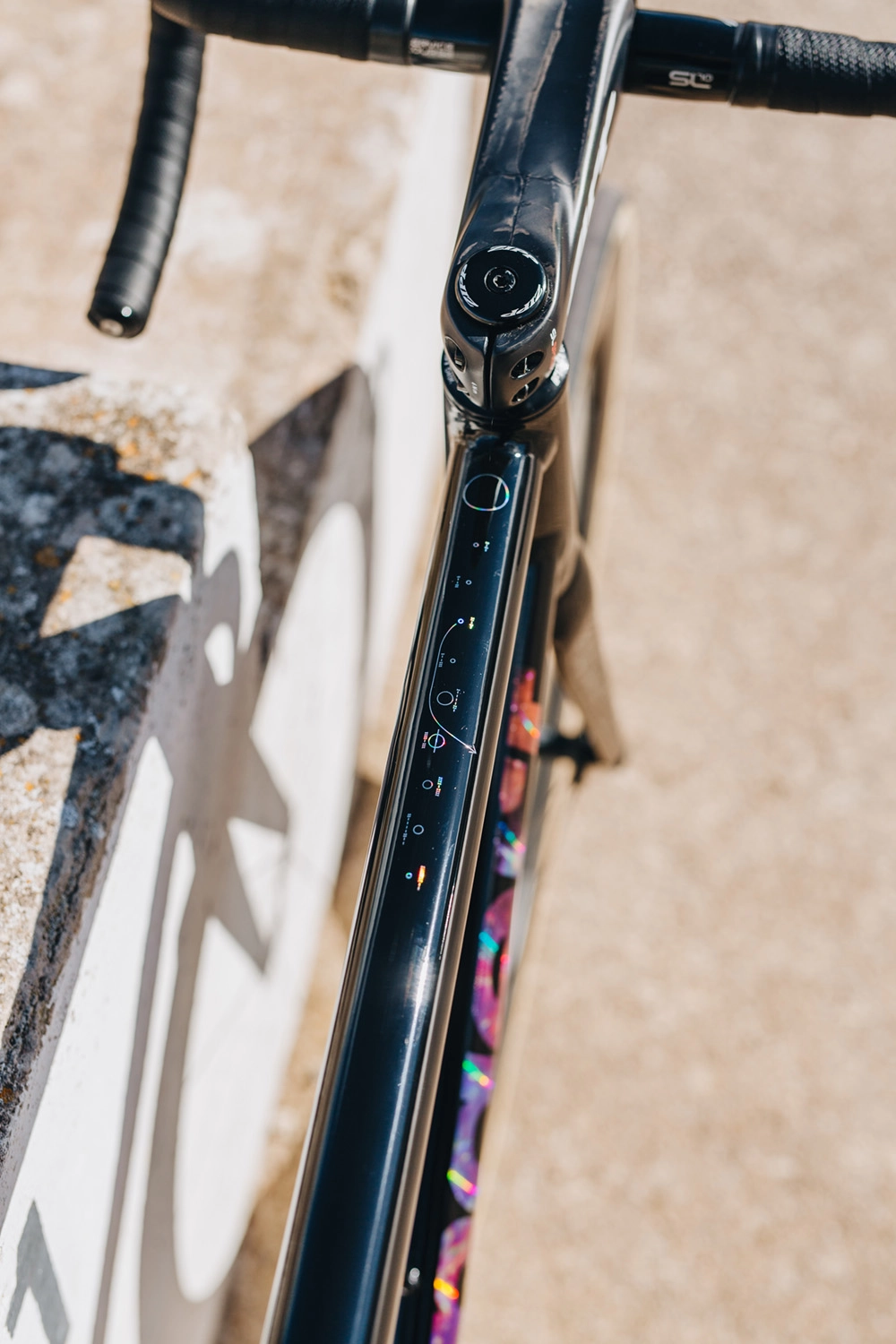
You've seen Johannes Schroth’s design work if you’re a part of the Standert Community: he designed our logos, the latest Standert Premium apparel line, and the Lucky Cat logo you see on your top tube when riding your Kreissäge. Earlier this year, our in-house designer and photographer Savannah met with Johannes at his Bergmannkiez studio to talk designing logos and instruments, growing up in West Berlin, and his rap career.
When did you come on board with Standert?
I was there from the very start in 2012, the same year I became a Dad. I always know how old Standert is because they started right after my girl was born.
So you had two babies then, an actual baby and a design baby…
It kind of feels that way, yeah. I’m doing more for Standert again now, after being hands-off for a couple of years. It’s good to be back on board again because everything’s flourished, and the ideas I contributed have held for such a long time. You guys filled the letters of the logo with so much value and meaning. It’s so enjoyable to come back to the brand.
You studied industrial design, right? Is that where you met Max (Standert CEO)?
No actually, through a friend, Anna (Max’s wife). Max started to design his own logo and then Anna intervened (laughs). No, I think she just hooked us up because she knew we'd work well together.
You started with designing the urban bikes logo, that has the rider icon included, then there’s the performance bikes logo – when did that second stage happen? Did Max know fairly quickly he wanted to move into performance bikes?
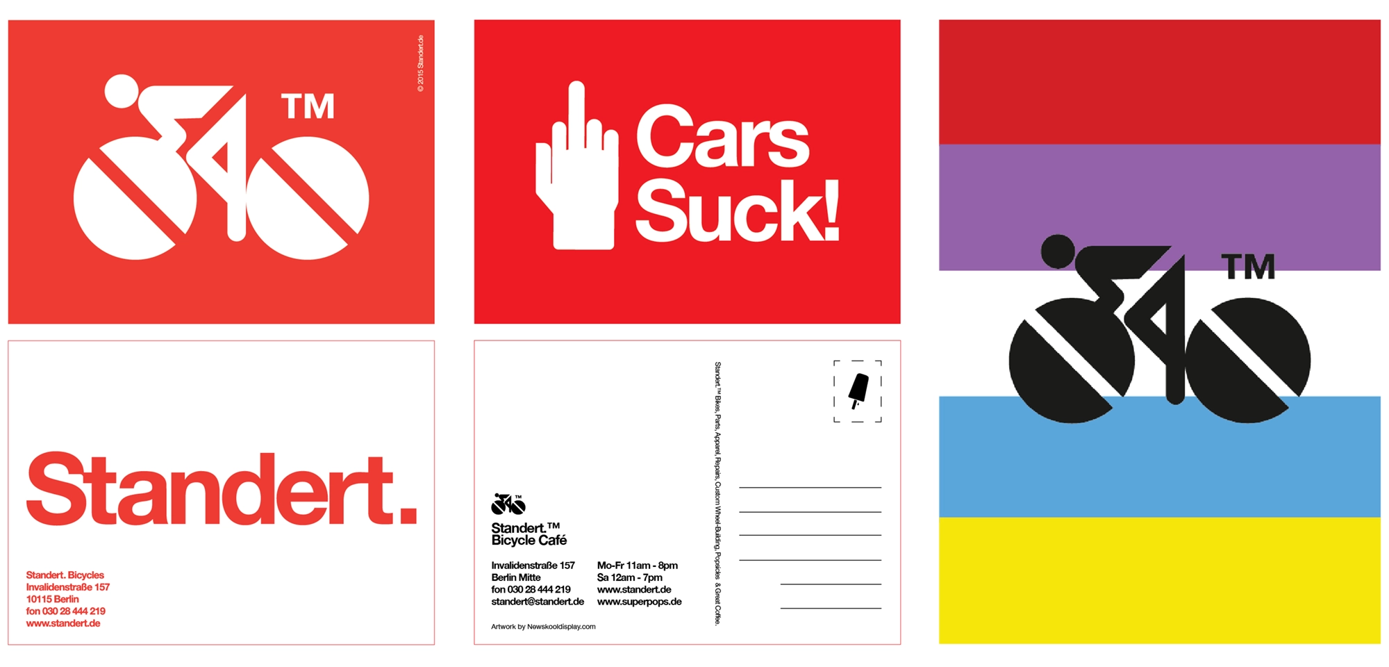
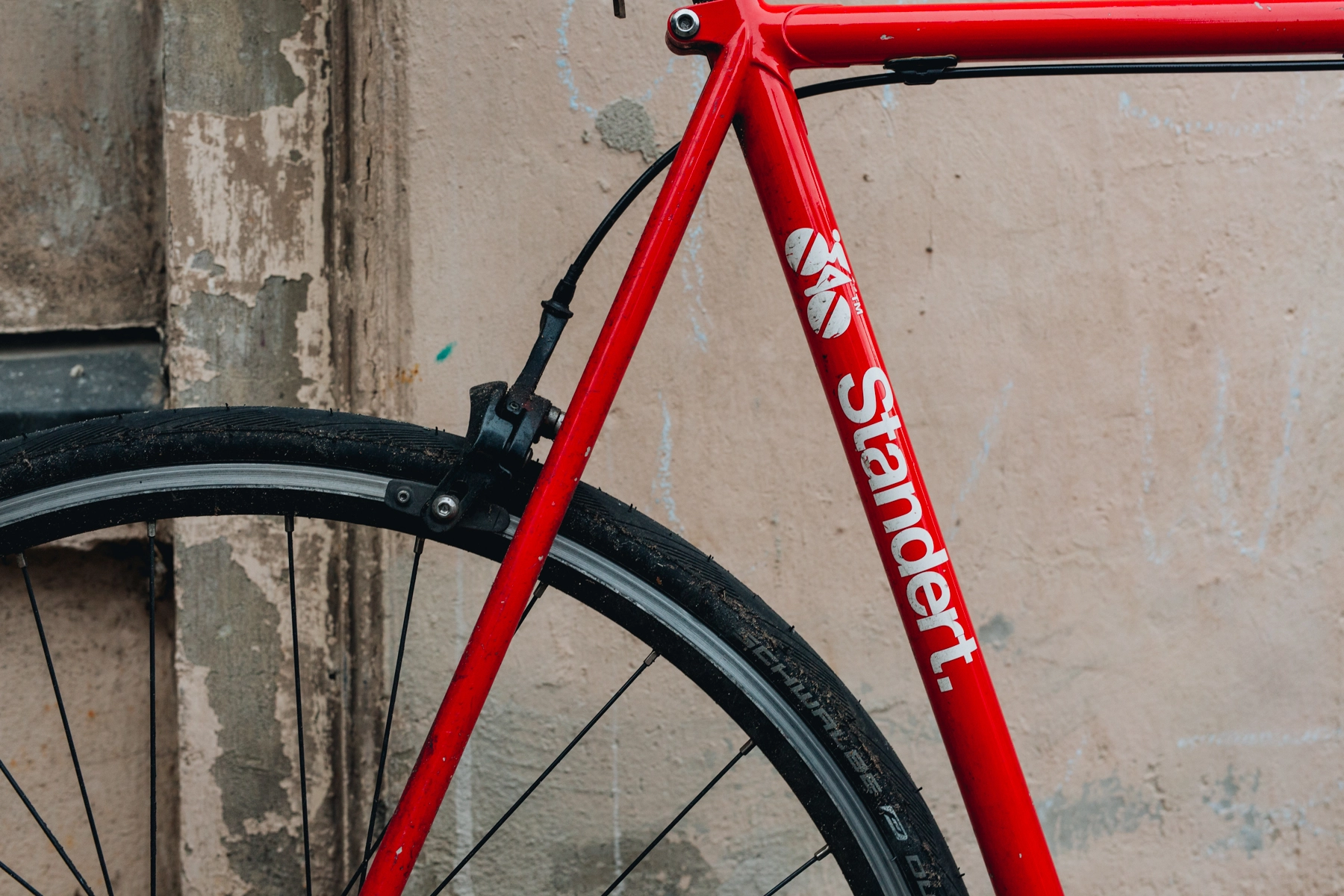
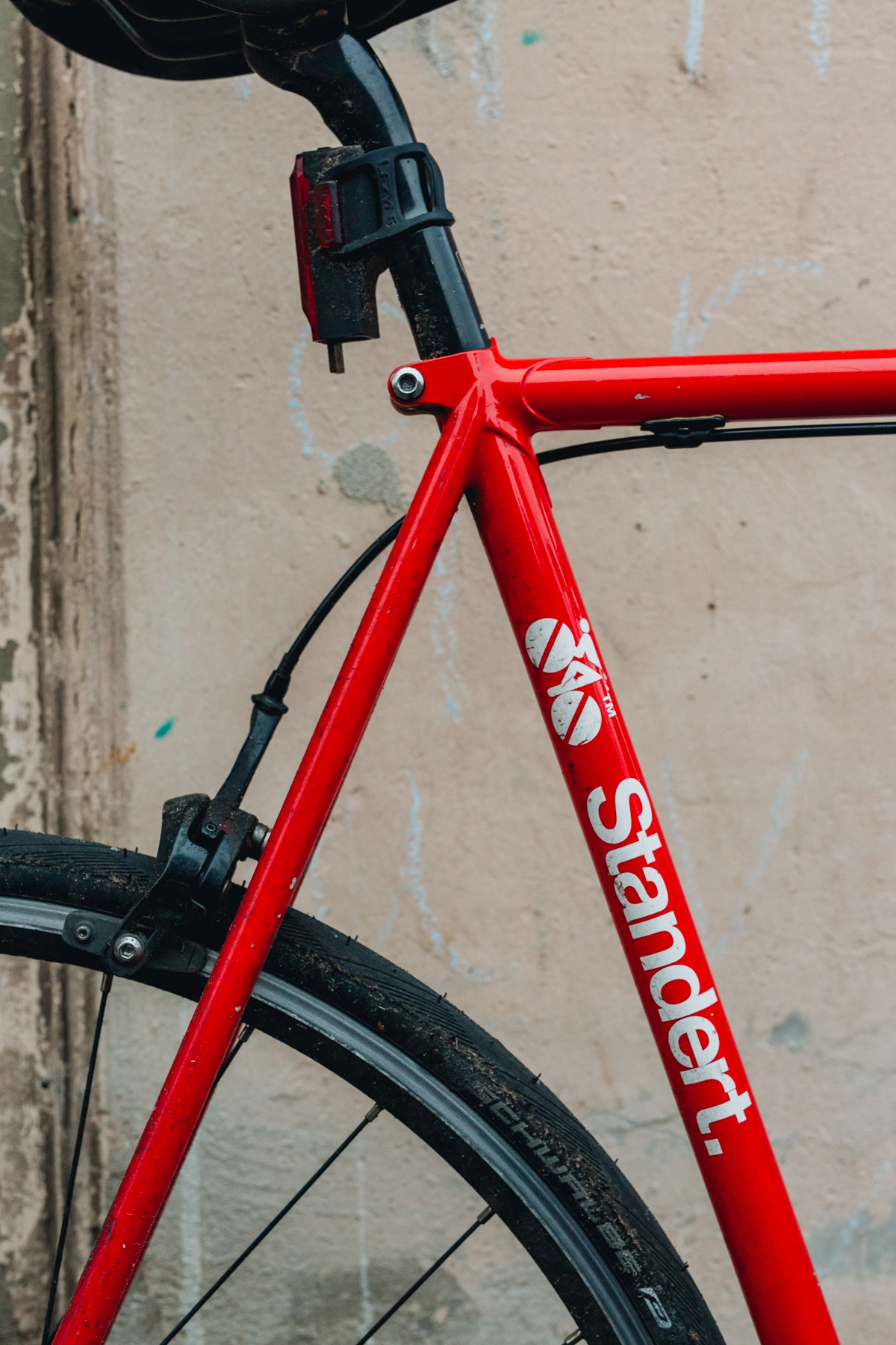
The bike-figure in the urban logo is inspired by Otl Aicher. He was a German designer who created all the stickmen icons for the ‘72 Olympics in Munich. Then, I think with the third batch of bikes, Max knew he wanted to do more race bikes. When we were designing the performance logo, the idea was to do something more in a Bianchi style. There are two big Helvetica references in the bike world: Panasonic and Bianchi. Panasonic is Helvetica Bold and Bianchi is Helvetica Extended. We went with Helvetica and slanted it to make it dynamic. It was clear that with a brand called “Standert”, where we were trying to create this quasi-generic brand, it needed to be Helvetica. There was an issue with the horizontal alignment of the "r" and the "t"s which spaced the logo uncomfortably: we wanted the logo tight, with a little hiphop influence. There was a love for hip-hop that I brought in because this is my cultural backbone. The left side of the t’s were colliding, so we chopped that off to make it unique –and that was it.
Massimo Vignelli still influences my decisions of what fonts to use for Standert. The core of Standert is doing things right, and when it comes to these classic, timeless aspects of graphic design, Vignelli — especially the book The Vignelli Cannon — is a good resource. So, there’s Helvetica, and then we picked Eurostile for the little bars of technical descriptions, because it’s kind of Italian and technical and spices things up.
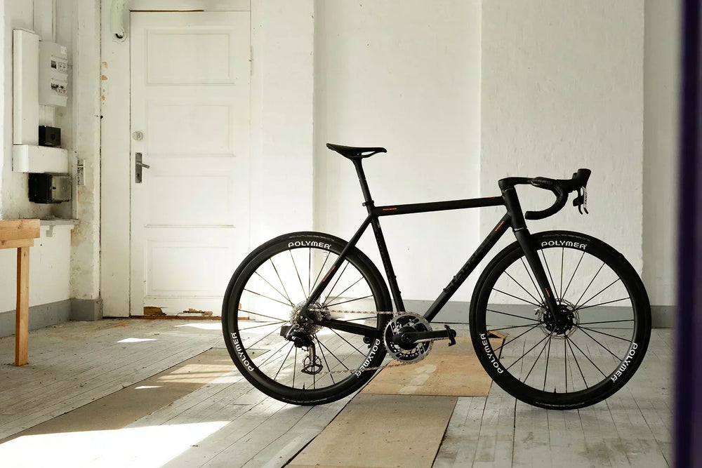
I agree, the fonts match so well. Especially on the bikes when you see them from different angles. The performance logo pops so nicely as a graphic element on the downtube.
Yeah, it really works.
What was it like designing for Standert in its early days?
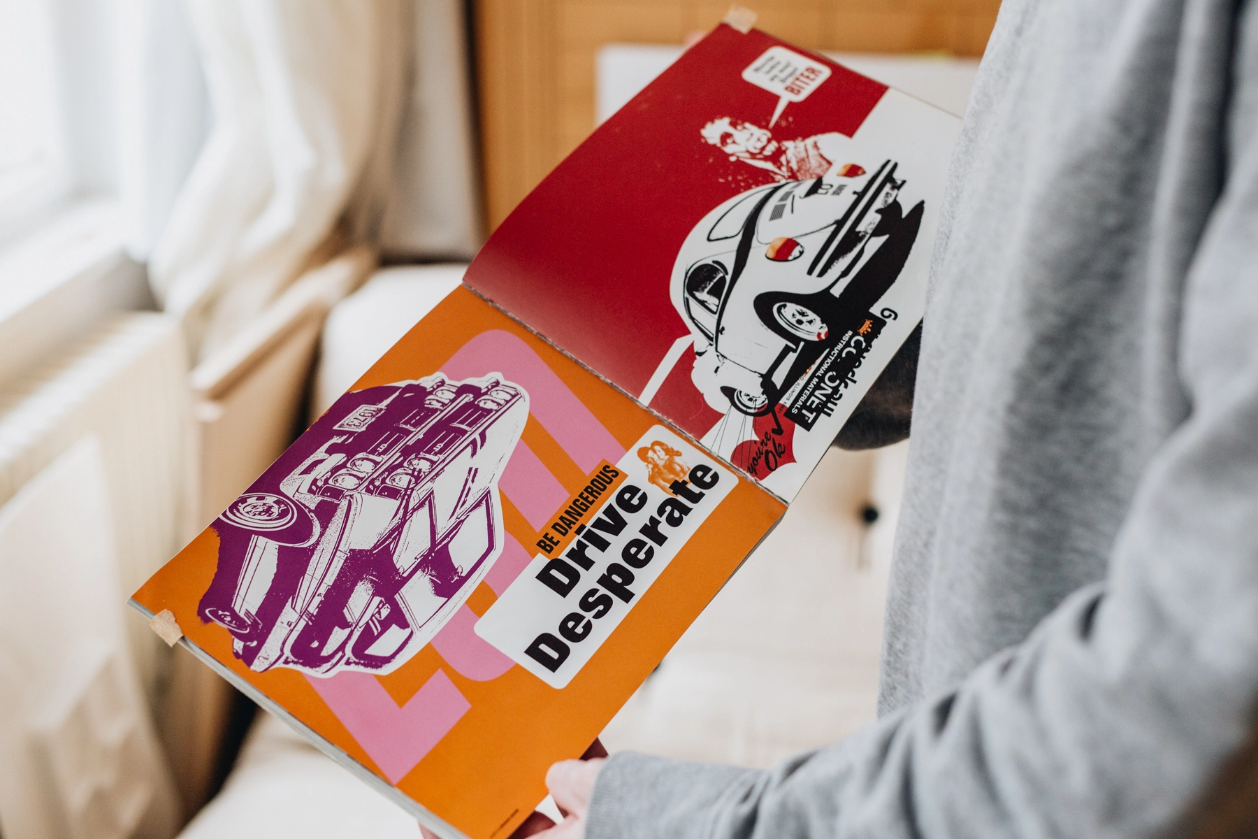
I remember I was really rebellious at the time. We made postcards with “Fuck cars” and shit like this. This was part of the wild, fixed-gear-inspired years at the beginning. Now, we’re speaking to a different audience. And maybe people even like cars, so we can’t be too punkish at this point (laughs).
Do you ride a Standert?
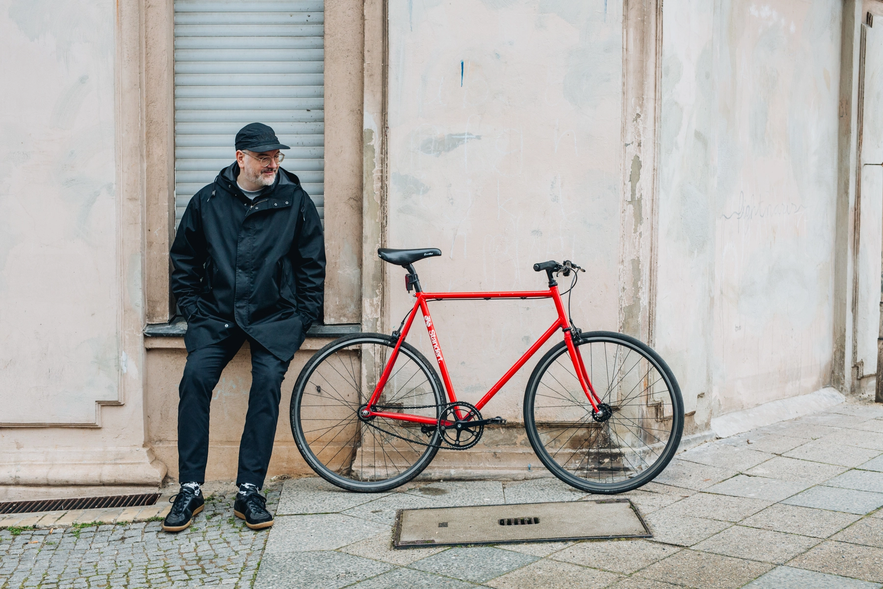
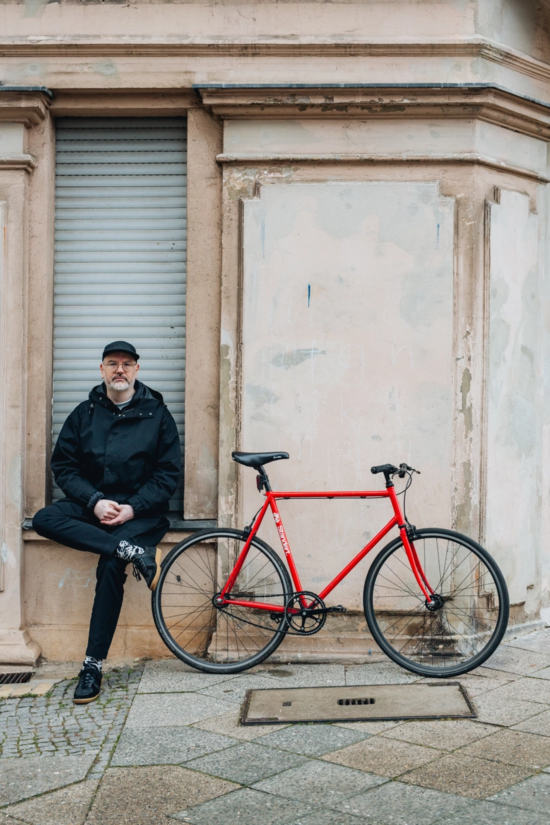
Yes, I have one from the first batch of frames. It’s got a really tight, kind of odd geometry. It’s quite twitchy. But I love it! All the tubes are really thin, it’s light and nimble. I love the bike actually, I’ve ridden over a thousand kilometres on it.
Did you grow up in Berlin?
I grew up in Zehlendorf aka “Ziggy Diggy.” I’m an original Berliner for sure. It’s a big part of my identity. West Berlin was an oasis for people who wouldn’t fit into the rest of Germany. It was really not like West or East Germany in many ways. There’s a song about the Berliner Luft – the Berlin air. It has this certain kind of energy.
The guys at work were telling me that you had a huge music career here in Germany. Can you share about that?
I started in the '90s, the Golden Era of hip-hop. My buddies and I were big into hip-hop and wanted to make music. I was already experimenting as a kid, without knowing what hip-hop was. I was drawn to the sound and bought a Milli Vanilli LP because that’s the only thing that was available to me without knowing much about the genre. Then, I found Public Enemy's Fear of a Black Planet and Tone Loc's After Dark featuring "Funky Cold Medina". These were the first three records I ever bought.
Back then, I had a little double tape deck recorder. When you let go of the pause button, it immediately recorded. I started to make tape loops: rewind, wait for the loop. I later figured out that this was something they were doing in the states called "Pause tapes." This is how I got into making music.
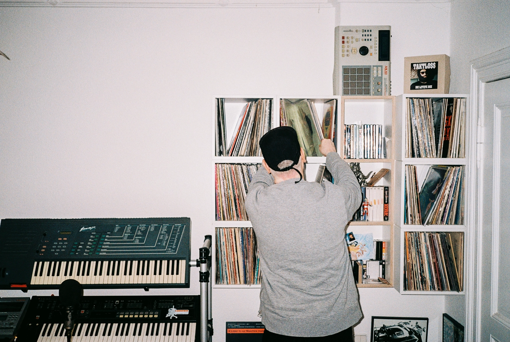
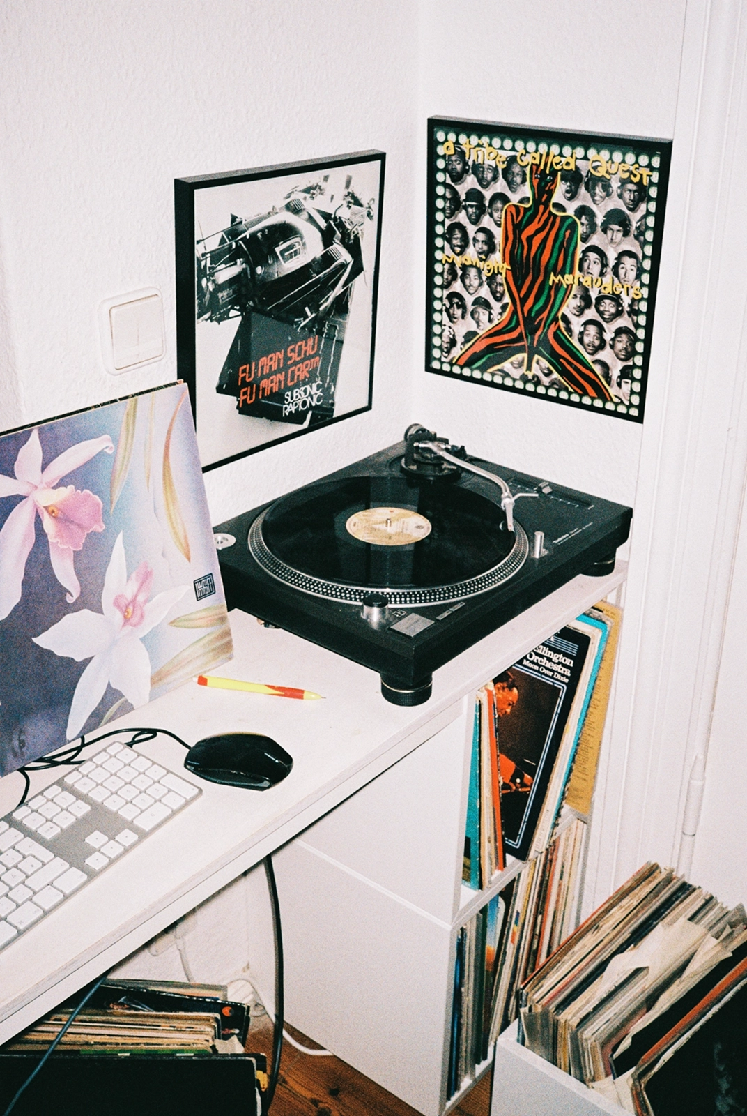
At age 14 or so, “MC Justus Jonas” and I started to make music with a little drum machine and rapping. We did two instrumental records. It took another five years until we were actually good. We started making tapes that we would release and sell ourselves, which led to us starting a tape label with a friend - Marcus Staiger. The label was called Royal Bunker. There was a reggae club around the corner that we rented out for one night each week and made a freestyle club there called the Royal Bunker. This became the epicentre for Berlin rap. A lot of acts that are still big today like Kool Savas and Sido were all there. From that formed MoR (Masters of Rap) with its most famous and best member Kool Savas, who’s still a star today. We made one quite influential record called “NLP”. That was basically our contribution to the culture. I released a solo tape called “Niedere Motive” (Lower Motives) and a solo LP in 2003 called “The Funky Adventures of Doctor Fumanschu.”
Then, I shifted my focus more to design because I had crossed this off my bucket list of things I wanted to achieve. There was also some real gangster influence in Berlin all of a sudden, actual gangsters. I didn’t want that in my life, and I didn’t want to move away. Some people – like Savas – had to move away, but that wasn’t really an option for me. When I stopped music, I wasn’t that young anymore. I had my solid 10 years of doing just music and touring and all of that, and I was 27 when I started studying industrial design.
So you weren’t already doing graphic design at all?
Back then I was also doing graphics, making covers. I worked for an infamous graffiti magazine called Backjumps. The ‘90s were also a golden era of graffiti in terms of craftsmanship and creativity, and Berlin was really above the rest.
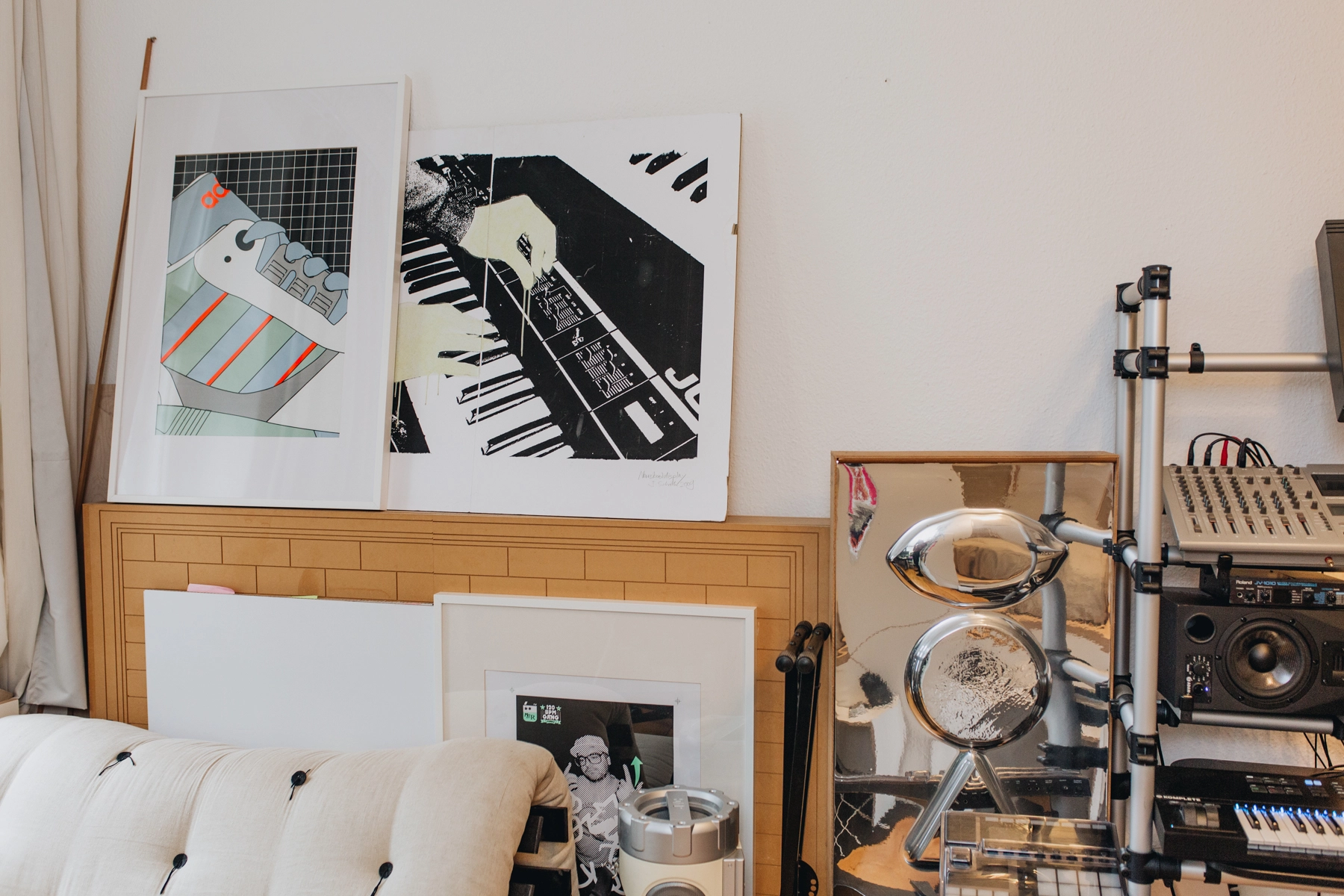
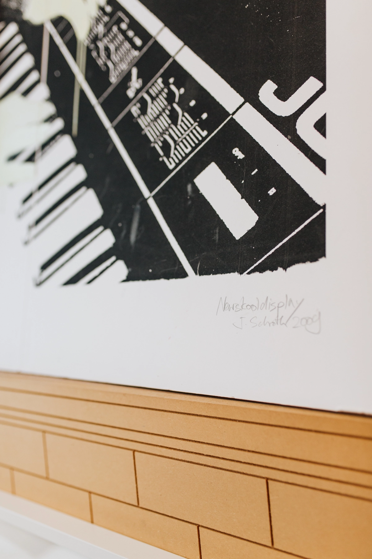
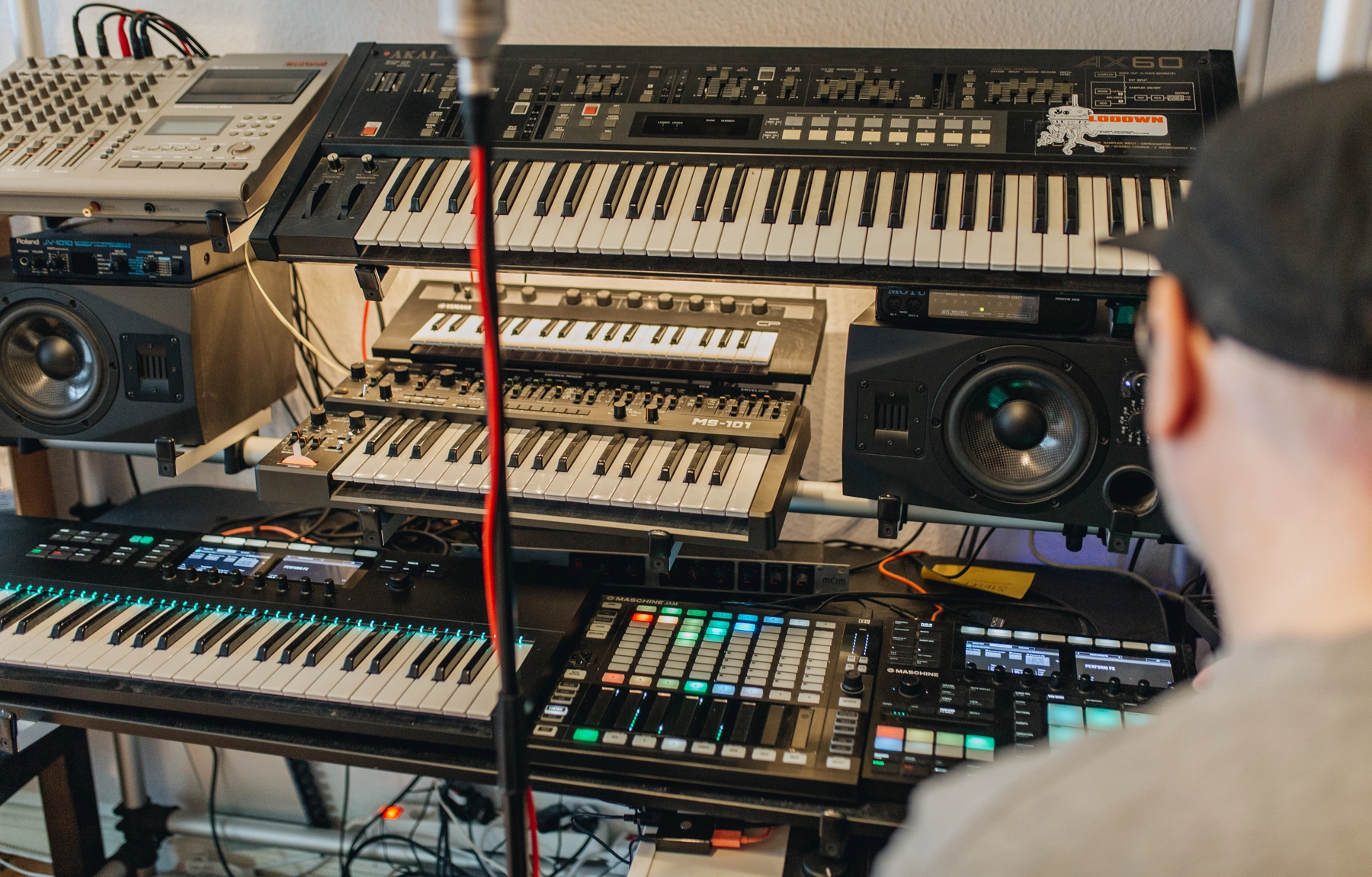
Your interest in design really seems to have emerged from the rap scene…
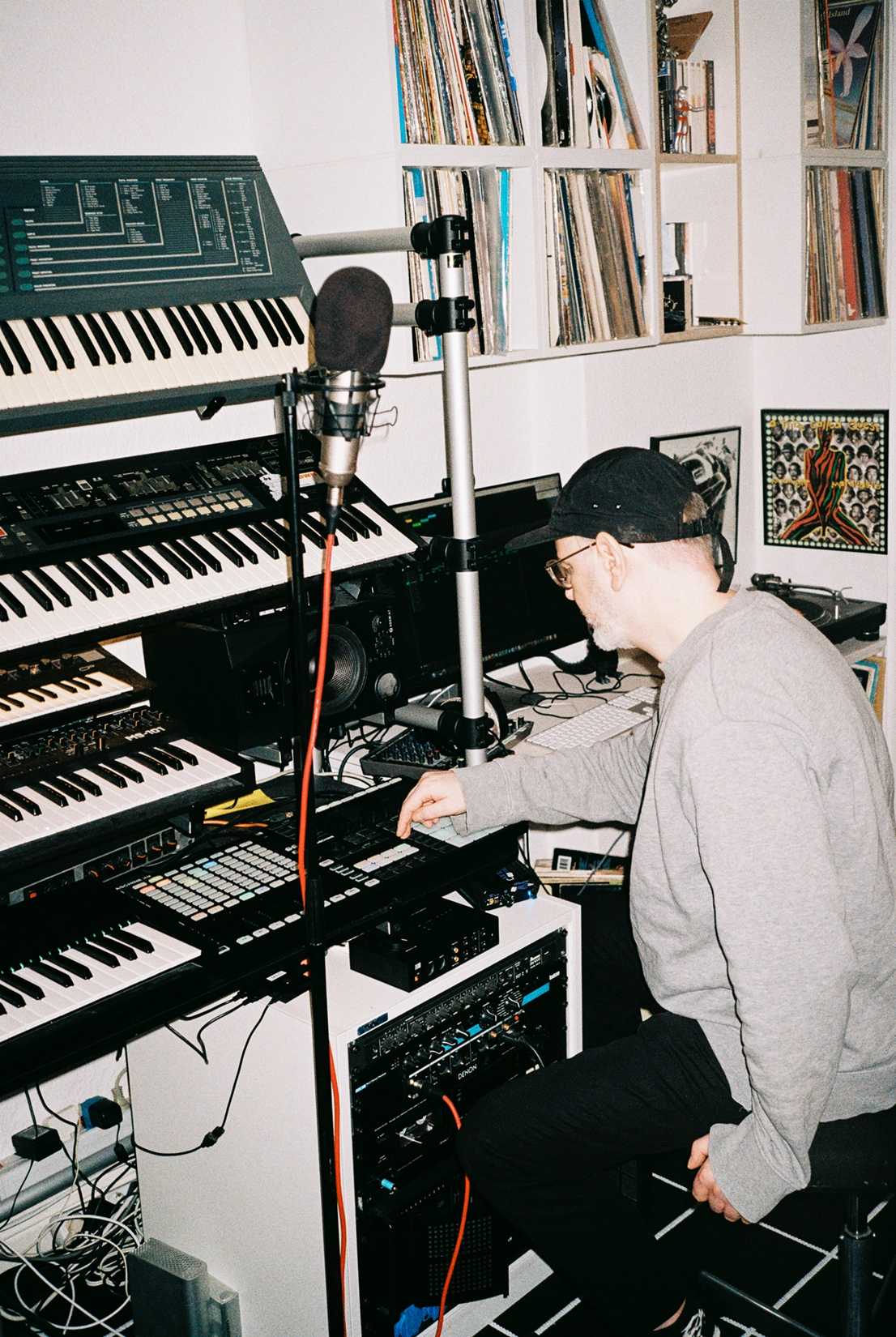
The hip-hop element coincided with those formative years when you find your own thing and aesthetic, so it was a part of it. Another influence that predates that was my dad and his architecture practice. That influenced me a lot. He’d take me to exhibitions as a kid. Architectural design is very conscious with its decisions; it’s all about creating order and there are some very progressive ideas.
I was also fascinated by Futurism at the time. There was this positive feeling about the future which is pretty much gone – it’s all dystopian now. There was a phase where I was trying to read everything I could about the climate catastrophe. Didn’t serve me too well emotionally, but it gives you an idea of priorities and what is really important. And cycling is definitely part of the solution. I think it’s a mix of the boldness of hip-hop and this idea of creating order and organizing information space that architecture gave me. These things moved me into design.
And so what did that shift look like?
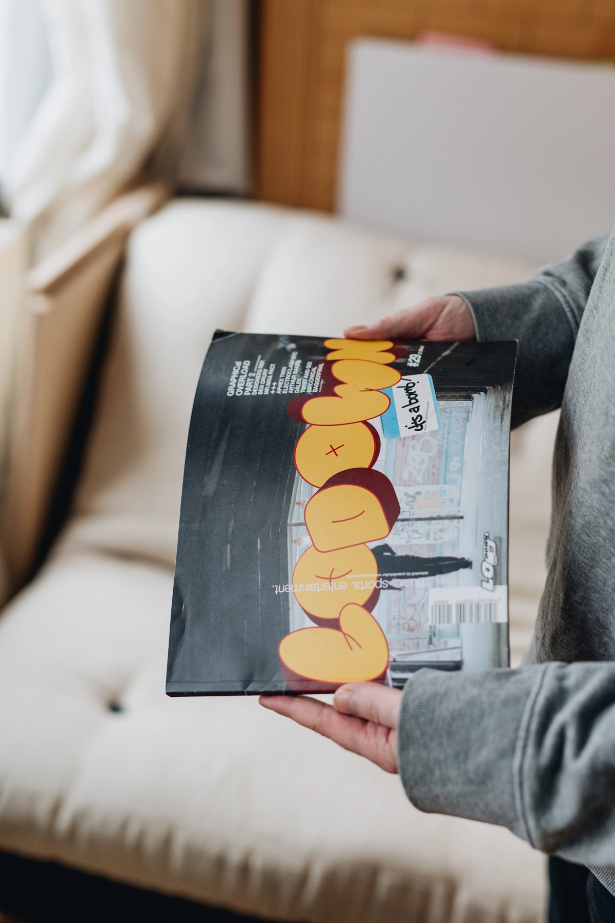
My first graphic design internship was at Lodown Magazine, which challenged all the rules. That was very David Carson inspired. The founder, and good friend of mine, Thomas Marecki, worked for Carson before he started Lodown. That helped me start a career as a freelancer and led to the job I did for Adidas originals in the early 2000s when I started my industrial design studies. While I was studying my Newskooldisplay freelancing kind of took off, so it took 7 years to finish my degree.
When I think about your approach to design it’s very structured and technical. Do you think that’s because of industrial design and the nature of the fact you’re designing precise products, or is it about having control?
Yeah, in some ways. I think it’s an aesthetic that I’m after, and that aesthetic is always rooted in childhood, right? For me, it’s the product aesthetics of the ‘80s that really inform my aesthetics. The structure isn’t something that came naturally to me. I’m quite a chaotic and wild guy, so I started with a lot of wild collage work. When it comes to graphic design, what feels best for me now is really the structured stuff. It’s like programming – you create rules, and when the rules work it’s so rewarding. It also creates this certain quality for the people who look at it, similar to the feeling of understanding a joke: you understand something unsaid…
Some greater context.
Yeah yeah! And you laugh because you understand the intellectual idea behind it. It’s the moment of a realisation that makes you laugh. I think good design should be like that. There’s something — you realise the pattern, and you appreciate it. I think that’s a great quality of good design. That’s what I’m striving for.
As a designer, I think you go through this process where, at the start, you’re about full aesthetics and want something to look “cool”. Then you start to formulate rules and systems. Then you start to think about experiences. I think that’s the final stage as a designer – you ask yourself, “What am I building?” I am building a puzzle piece of an experience, and with my prop in this scene I bring people to the greater scene.
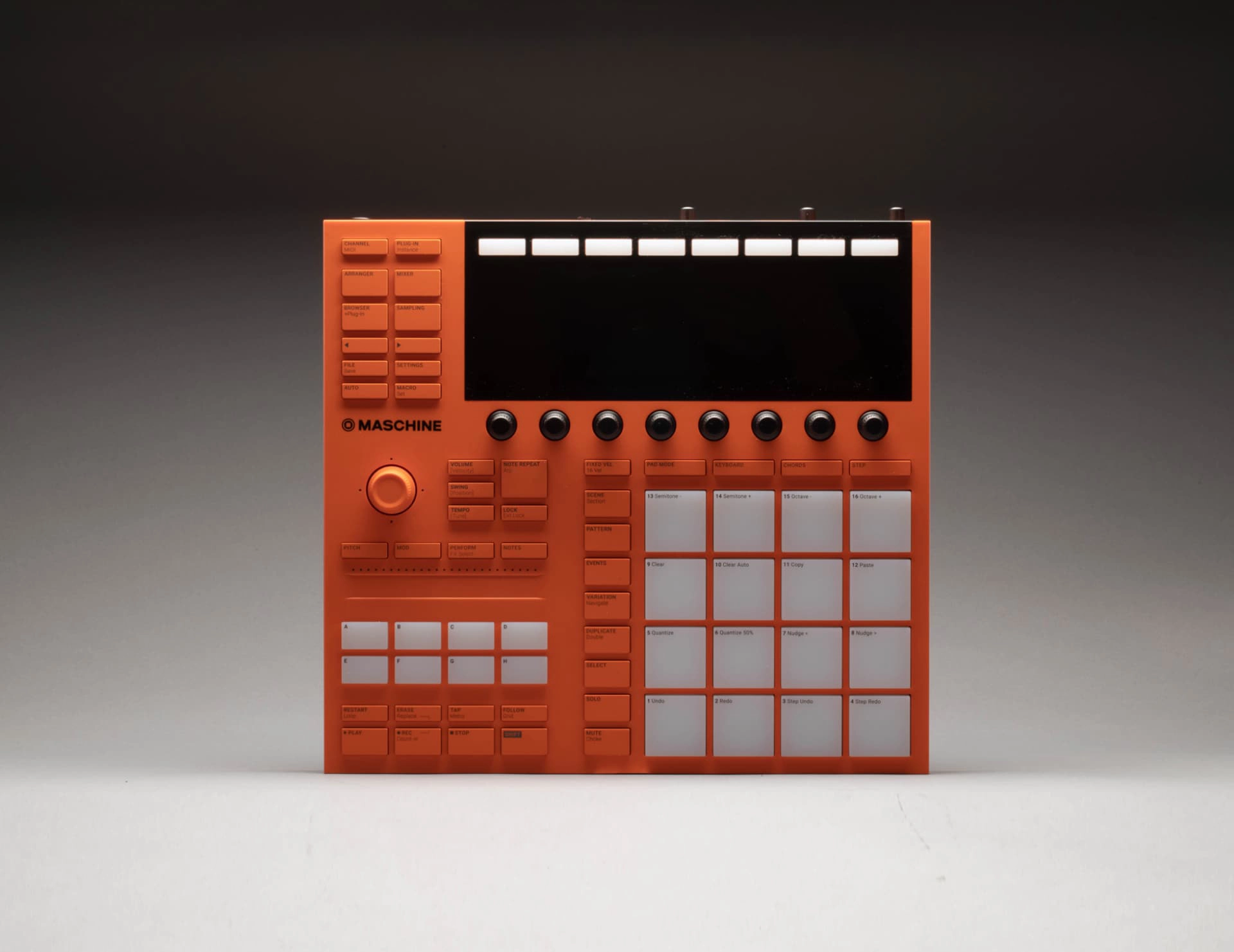
If you have products with multiple components, there are all these layers that compile on top of each other. When I create for Native Instruments, I’m designing for something that has a screen with layers of other information in addition to a physical surface. There's this physical object that has social weight, implications and value, and says something about you: I make music.
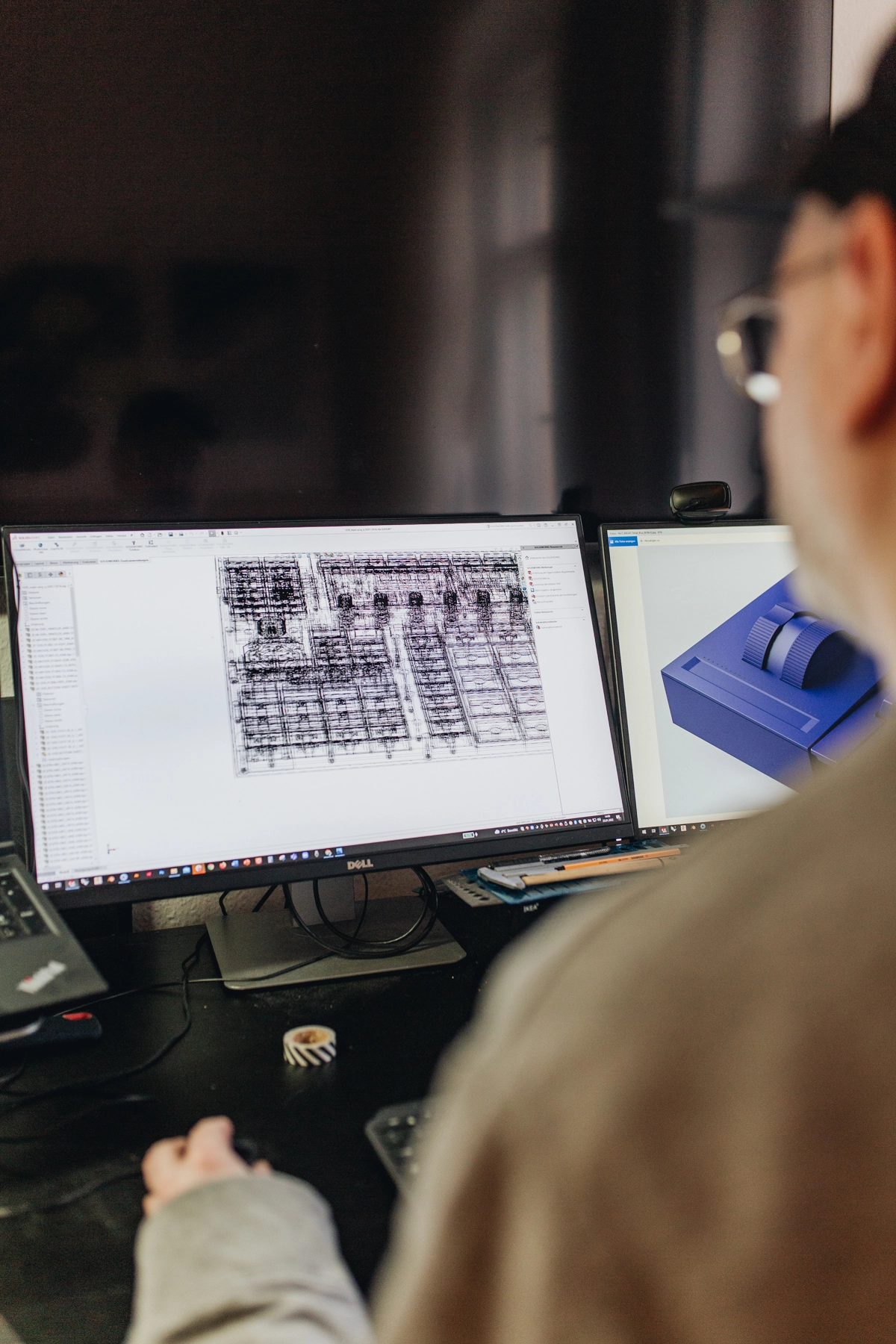
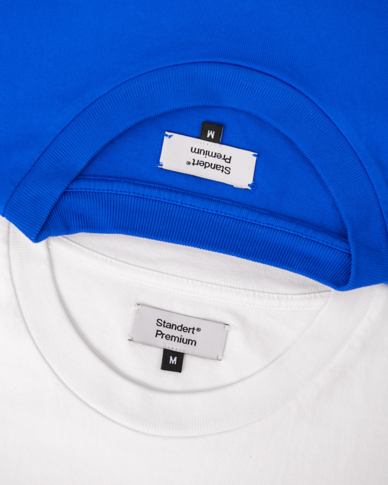
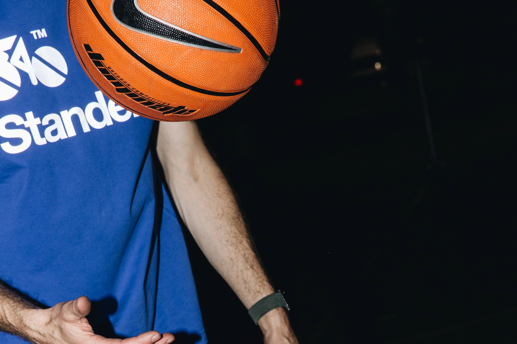
For Standert, the experience is the bike. This experience comes together with the website, the layers of the brand and design, and your photography. This experience should be informed by the philosophy of Standert, which is making things right. I think the first attempt to fully realise this was the Standert Premium clothing line, with beautiful fabrics and a very classic repertoire of core graphics.
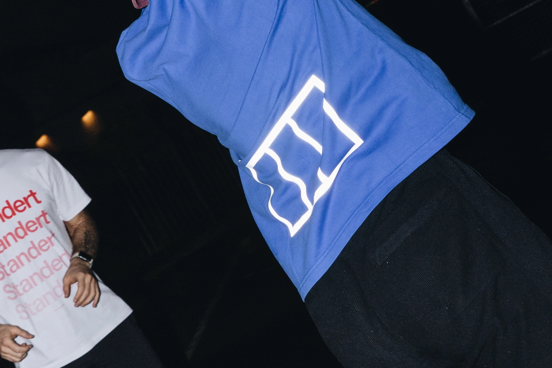
And some new ones like the pocket graphic?
That’s true! Super abstract, right? (laughs). Bringing this into this very functional clothing and some other projects we’ll release later this year, are building the dimension of the brand out more and bringing it all together to make it work and while also creating sandboxes for crazy ideas. Standert is almost traditional in a way, but then being joyful and having fun is also part of the brand, shown by the crazy colour schemes. That’s the interesting contradiction.
I agree, and I think this relates to the quasi-generic name. I’ve had people in Australia ask me about the name being “Standard” or “Standert” – and I guess this is because the bikes are anything but standard in their quality and experience. I think this meeting of slick and playful sums up the brand. When I started at Standert and looked at your design approach, I thought it was very rule-based, but within that you accessed this playfulness, like the “only rideable in snow, rain… icons.” Like the “fuck cars” stickers, and the postcards of Max kneeling with a frame in the studio. It’s clean, but doesn’t take itself too seriously – that would really lose people.
Exactly. I think that’s the really interesting thing–it’s always both. That’s part of its appeal and how it’s been around for so long.
To wrap it up maybe you could share what you imagine your role is at Standert going forward?
I want to continue facilitating Standert's growth. I want to help create structures for the grassroots initiatives within the company. We’ve got the website redesign, and some cool collaborations in store this year… it will continue to evolve. It’s going to be a good year.
You can follow Johannes' design work on his website, Instagram or listen to his music on Spotify, Apple Music or Youtube.
